Reinventing Banking & Trading on iPad for Keytrade Bank
This is the END.
We created an iPad app for Keytrade Bank, and we just launched it!, You can download it here.
Please contact us if you what to talk with us about this reference & our expertise!
Mixed feelings: happiness because it’s really a major achievement, nostalgia because we really loved building this app and now we are just slightly nervous as we hope users will love to consult their accounts, transfer money and trade using the Keytrade app as much as we enjoyed creating it.
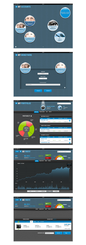
For the banking part, this app allows one to customize accounts (rename accounts, assign pictures to each account), to consult the list of transactions, to transfer money and to visualize the monthly In & Out of an account with clear charts.
With respect to trading, our app offers a heatmap updated in real time with all the markets and all companies (when available from provider) and, of course, buying and selling stocks is possible from within the app. One can also consult the personal portfolio containing an overview of all trades.
To get a better idea of this project, here are some metrics:
- 8 months
- 2 Product Owners, one for Banking, one for Trading (from Keytrade Bank)
- 1 graphic designer (from Keytrade Bank)
- 1 UX designer
- 4,5 iOS developers (among them 1 from Keytrade Bank trained by OCTO) + 1 Scrum master
- 2 web-services developers (from Keytrade Bank)
- 21 Sprints
- 29 storyboards
- 1 user test session
- 302 User Stories & 2 300 complexity points
- 46 Releases of the app
- 3 languages
- 45 K lines of code (frameworks excluded)
- 17 K lines of comment
- 1 035 Unit Tests
Quality First
Quality has been the primary focus from the start.
For example, when a developer finished implementing a user story, another one had to validate the feature and to review the code. When peers validated the story, the product owner (PO) had to test the feature to ensure it matched what he had asked for.
To lower the numbers of bugs, we used the TDD (Test Driven Development) method. We tested the logic and the model of the app.
To change the state of a story from “in progress” to “done” we had to respect a checklist: this is called a Definition of Done (DOD). For example, we had to check if the code was clean, well documented and tested, if it didn’t add warnings etc.
We also had a continuous integration server (Jenkins). On each commit, an automatic build ran the unit tests and gave us metrics like number of lines of code, code coverage, code duplication. My colleague Cyril Picat described in this article how to add these metrics Jenkins for iOS.
With all these standards we dramatically decreased the number of bugs. However since the project is quite large, one may discover bugs from time to time that will be fixed in the next versions.
Each week, we released a new version of the app to Keytrade employees’ iPads. This process can be time consuming, that’s why we decided to automate it. So we just had to press a button and the users received a notification on their iPads to install the new version.
So, how did we do it?
It’s really simple, we created a new job on Jenkins, which build the app thanks to the Xcode plugin, and then we pushed it to Appaloosa, OCTO deployment solution available as SAAS.
UX Rules !
For us, User eXperience (UX) is really important. We believe a good UX changes everything. That’s why we had a UX designer during the whole project to challenge every usage, to create new patterns of banking and trading on tablets.
This was the first time that Keytrade worked with a UX designer. At first, people didn’t understand how and why creating user interfaces was complicated.
After a few months, we can see how UX improved our app, and how efficient it is to work with a UX designer during a project.
At the end of the project, we gave the opportunity to Keytrade’s real customers to test the app during a dedicated users testing session, before launching it on the Appstore. We received a lot of feedback, and of course, we worked one extra month to improve the app taking into account the remarks and recommendations!
Now, Keytrade Bank wants to hire a full time UX designer, … another proof that UX is not an option for quality apps !
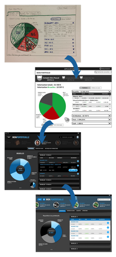
The following images show us how UX helped us in our process.
This is an iteration process (Agile):
- First a UX designer drew the screen on a sheet of paper and in powerpoint
- Then the product owner validated the storyboard with the UX designer and added Business Rules on the powerpoint for the development team
- The graphic designer and the developers could start their work and iterated with the whole team.
Be Agile, be able to change everything, anytime.
At OCTO, we work using the Agile methodology. We believe Agile helps us to deliver better products that better fit the needs. It was the first project with Agile methodology for Keytrade.
At the project start, we had no idea of what we will create. We didn’t know how we should present data, what should be in the app, what shouldn’t.
The only thing we knew is that we wanted to change how people interacted in banking and trading on tablets. We wanted to be a reference, to be the #1 of the Appstore!
We created a lot of features, and we didn’t keep them all. We threw away a lot of concepts. We developed, designed, integrated the design, and fixed bugs on features that we didn’t ship.
Why ?
Because we wanted to give users the best we could deliver, a valuable product. We didn’t want to deliver useless features. Sometimes we deleted features; sometimes we rebuilt them from scratch.
It can be hard to accept, when you have worked for several hours and spent a lot of time and energy on a feature, but it’s important to go through with it for the quality of the final product.
Takeaways
To help us in our Agile approach, we had some tools. In particular we used Kanban Tools and Google Docs. These 2 tools were synchronized thanks to custom Google apps scripts. These scripts are really powerful when using Google Docs.
Our product backlog was a spreadsheet, which was hosted on Google docs. When we added or modified a task, it was automatically updated on our Kanban.
The most important point was the great collaboration with the Keytrade teams: the graphical designer, the back-end developers & the marketing team but also the business experts & the top management. And first, to ease collaboration being in the same room helps a lot. We were in Keytrade premises 3 days a week. We were really close to the back office team, which is a good thing to quickly solve problems, and ease communication. This has been a strategic decision that saved us a lot of time.
Once a week, we demoed our progress to the Keytrade management team. This was important for us to have their feedback in order to know whether the product fitted their needs.
As a result, Keytrade wants to go further on Agile methodology and considers starting more Agile projects.
To conclude, our whole team Keytrade+OCTO is really proud of what we have created! This is probably one of the best apps OCTO have worked on. At this very moment, while writing this article, Keytrade Bank is the first app of the Appstore (in Belgium). And the score of the app is 4+ on the store.
You can have a quick overview of this with the following screenshots, but the best way, is to test it!
This is the End of the V1…. But just the beginning for this app!

