Better understanding of Android accessibility for blind people
Making your app accessible is making sure that people with disabilities can use your app without any extra help from another person : you wouldn’t want to be forced to ask for help every time you use an app, do you ?
Despite being an obscure topic, most articles I read about accessibility tend to follow a common pattern : they enumerate technical solutions focusing on “how” to use them. For each solution, a brief description of “what” problems people with disabilities may encounter is given... As someone who worked with them for 4 years, I am already aware of these problems, thus I quickly understand what those articles refer to. But that might not be the case for most readers, often developers.
That is why in this article, I will pinpoint these problems, giving concrete examples about blindness issues. Hopefully, it will give you a better understanding of why accessibility is important, and how simple it is to solve some issues when you directly work with actual users, here blind people.
TalkBack
Before going further, I have to explain how blind people use their phone. They use a tool named TalkBack. It is a screen reader that greatly changes the way you use your phone.
For those of you who already know about TalkBack, you can skip to the next paragraph. For the others, I’ll try to explain : it allows you to “explore” elements on the screen touching it with your finger. You will get an audio feedback on the visual element your finger is on and it will “select” this element. Once an element is “selected”, to actually “click” on it you will have to “double-click” anywhere on the screen.
But that’s how WE (developers) use TalkBack, not how blind people actually do… Blind people navigate through elements in reading order.
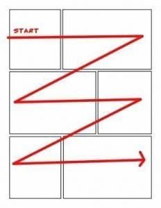
They use a swipe left-to-right to “select” next element, right-to-left to “select” previous one. Images speak louder than words, so here is a video that explains it better (starts at 2m05s, you can stop at 3m25s) : https://youtu.be/YJSWYLZD8EI?t=125
Now that you know how TalkBack works, let’s get started !
An example that could be you!
Bob is a developer who made an app that is supposedly so simple that his grandmother Alice could use it... but never actually tried.
It is an app listing puns, with quick actions on each line : like, comment and share. There is also a floating button to submit your own pun. It looks like this :
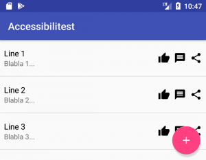
There is also a detailed screen for each pun to give explanations in case you didn’t understand it. This detailed screen also includes the same actions as listed earlier : like, comment and share.
Before publishing his app, he decides to let Alice test it, just in case… but Bob learns that Alice became blind since the last time he saw her. He decides to proceed anyway, that would make an even better test !
Content description
After few minutes of testing, Alice calls Bob.
Alice : Hello Bob, I really appreciate that pun about “Line 2”, I would like to send it to one of my friends. How can I do that ? Bob : It’s simple, just hit the “Share” button. You know, the one with three dots that forms a “less than” symbol… Alice : They all “look” the same to me *giggles*. Is it the first, second or third button after the text ? Bob : Uh… right sorry. It’s the third one Alice : Alright, thank you. You should add a description to your buttons !
Indeed, from Alice’s point of _non-_view, all three buttons look the same, as if you had this screen :
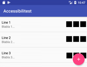
TalkBack can’t read images, and neither can you ! Therefore, it will describe the app’s quick actions as “button”. But it can read its textual description... if there is one, which is usually referenced as : contentDescription.
As for how to set them up, I’ll let Google explain : contentDescription's documentation.
Making navigation smooth
Minutes later, Alice strikes again.
Alice : Your app is great, but if I just want to read a lot of puns, I have to “scroll” a lot. Any way to avoid that ? Bob : What do you mean ? Alice : Ideally, it would be great if I could skip the “Like”, “Comment” and “Share” buttons on the list, because I can do it when I select_*_ a pun anyway Bob : Uh ok, I’ll see what I can do.. * Meaning, accessing the pun’s details screen
To better understand what Alice means, let’s see :
- On the left, what the screen looks like from Alice’s perspective
- On the right, how TalkBack outlines the screen
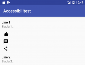
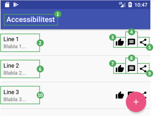
Each framed element can be selected using TalkBack. The number next to it is the number of swipes (referred as “scrolls” by Alice) to do in order to reach and select outlined element. So in this example, to access “Line 3”, Alice has to swipe 10 times. For “Line 10”, it would be 38 !!
Bob does not want to hide these quick actions : it’s a key feature of his app. However, they can be “hidden” from TalkBack. These actions can be triggered in the detailed pun’s screen anyway. With this little tweak, TalkBack navigation on this screen would look like this :
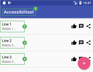
Thus, this makes “Line 3” reachable with only 4 swipes instead of 10. For “Line 10”, it is 11 swipes instead of 38.
To make views “hidden” from TalkBack, you have to declare them as “not important for accessibility” using an Android property called importantForAccessibility : documentation here.
Reading order problems
Now that Alice can read a ton a puns with ease, she has ideas she wants to submit but can’t find any way to do so on the app. So she calls Bob again…
Alice : Hi again, there are a lot of puns on your app, did you find everything by yourself ? Bob : No, of course not, users can submit their own ! You can use the floating button on the bottom right of the screen. Alice : Oh, is it after the list ? Bob : Yes. Alice : Now I understand why I couldn’t find it…
Let’s take a look from TalkBack’s point of view to see what is off :
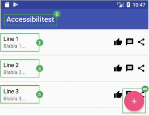
Problems are :
- You have to “scroll” through all elements of the list in order to reach elements below it
- The list can have a huge (or worse, infinite) amount of elements
It means that Alice will have to do a nearly infinite number of swipes to reach the “submit” button… Other blind people would probably never know that the “submit” feature even exists ! Changing your UI to resolve this issue would be very ugly. A better way to do so is to change TalkBack’s reading order. Let’s say we want our “submit” button to be reached before the list of puns, TalkBack’s navigation order would look like this :
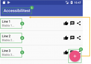
Once again, this can simply be done using a single Android property : accessibilityTraversalAfter or accessibilityTraversalBefore.
In that case, all you have to do is declare that the “submit” button must be “traversed” before the list. As usual, the link for more details : documentation here.
Conclusion
Making an application hoping that it would be easy to use, even by blind people, will likely not happen. In this example, they will only be able to use about 20% of Bob’s app : read puns laboriously, ... and that’s all. Yet, as you can see, it takes little to no effort to make it to a 100% !... there is still some room for improvement though.
However, it is difficult to identify what will not work… One good way to do so is putting yourself in the user’s shoes, to find “what” problems they might bump into. Better : you can ask an actual user for feedbacks. Here I have only listed 3 of them, that’s far from exhaustive !
I hope this article will inspire you to make your apps more accessible !