MaterialShapeDrawable Android: guide pratique
Material Components is the (not so) new library made by the Material team to replace the old support design library. It provides components to apply Material Design in your application with ease. Among these components, you can find the famous <br>FloatingActionButton<br>, the <br>CardView<br> or the <br>BottomSheet<br>. But there are also some less known, nonetheless powerful, components. And one of them is the <br>MaterialShapeDrawable<br>.
Note: This article was written using the version 1.1.0-alpha07*> of the Material Components. <br>MaterialShapeDrawable<br> existed in the 1.0.0 stable but the API changed quite a lot in the version 1.1.0-alpha01.*
In a nutshell
MaterialShapeDrawable is a drawable from the Material Components library for Android. It lets you create custom shapes with different colors, strokes, corners, edges, shadows and animations. With ShapeAppearanceModel and Material Theming, the same shape configuration can be applied to individual widgets or to an entire application.
What is <br>MaterialShapeDrawable<br> ?
According to the documentation:
Base drawable class for Material Shapes that handles shadows, elevation, scale and color for a generated path.
And by <br>Shape<br>, they are referring to the Material Guidelines shapes: Rectangular shapes with curved or angled edges and/or corners...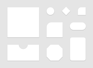
In the <br>build.gradle<br> of your app, add the new dependency (or update it if you already use Material Components)
<br>implementation 'com.google.android.material:material:1.1.0-alpha07'<br>
We will start by creating a new <br>MaterialShapeDrawable<br> and setting it as the background of a <br>TextView<br>.
<br><TextView<br> android:id="@+id/helloTV"<br> android:layout_width="wrap_content"<br> android:layout_height="wrap_content"<br> android:layout_gravity="center"<br> android:padding="8dp"<br> android:textColor="@android:color/white"<br> android:text="Hello world!" /><br>
<br>val shapeDrawable = MaterialShapeDrawable()<br>helloTextView.background = shapeDrawable<br>
The drawable supports a couple of customizations like:
- Fill color
<br>shapeDrawable.fillColor = ColorStateList.valueOf(colorAccent)<br>
- Strokes
<br>shapeDrawable.strokeWidth = resources.getDimension(R.dimen.stroke_width)<br>shapeDrawable.strokeColor = ColorStateList.valueOf(colorPrimary)<br>
If your view has elevation, a shadow will be cast on API above 21 like any other drawable. But this drawable supports a compatibility version of shadows for devices running API lower than 21. In this case, you need to specify the elevation on the drawable itself:
<br>shapeDrawable.elevation = resources.getDimension(R.dimen.elevation)<br>
For now, this provides nothing more that a simple ShapeDrawable couldn’t do, apart from the compatibility shadows. So what’s the point?
Introducing <br>ShapeAppearanceModel<br>
A <br>ShapeAppearanceModel<br> is a model of edges and corners used by a <br>MaterialShapeDrawable<br> to render itself. Every <br>MaterialShapeDrawable<br> has a <br>ShapeAppearanceModel<br>.
The default <br>ShapeAppearanceModel<br> has 4 rounded corners with a 0px radius and 4 flat edges. And of course, you can customize it in order to provide your own model:
<br>val shapeAppearanceModel = ShapeAppearanceModel()<br>shapeDrawable.shapeAppearanceModel = shapeAppearanceModel<br>// or<br>val shapeDrawable = MaterialShapeDrawable(shapeAppearanceModel)<br>
Corners
<br>ShapeAppearanceModel<br> has two out-of-the-box types of corners: rounded and cut.
8dp rounded corners
8dp cut corners
You can change all 4 corners at once:
<br>val cornerSize = resources.getDimensionPixelSize(R.dimen.corner_size)<br>shapeAppearanceModel.setAllCorners(<br> CornerFamily.CUT, //or CornerFamily.ROUNDED<br> cornerSize<br>)<br>
Or you can change each corner individually:
<br>shapeAppearanceModel.setTopLeftCorner(CornerFamily.CUT, cornerSize)<br>shapeAppearanceModel.setBottomRightCorner(CornerFamily.ROUNDED, cornerSize)<br>
different corners with strokes
You can also create your own corners. <br>ShapeAppearanceModel<br> uses a <br>CornerTreatment<br> object for each corner. The previously shown ways of customizing the corners were just shortcuts to build instances of <br>CutCornerTreatment<br> and <br>RoundedCornerTreatment<br>.
You can also write your own implementation of <br>CornerTreatment<br> if cut or rounded corners are not enough for you. For example, if you want an inside cut corner, you could use this implementation of <br>CornerTreatment<br>:
<br>class InnerCutCornerTreatment(cornerSize: Float): CornerTreatment(cornerSize) {<br> override fun getCornerPath(angle: Float, interpolation: Float, shapePath: ShapePath) {<br> val radius = cornerSize * interpolation<br> shapePath.reset(0f, radius, 180f, 180 - angle)<br> shapePath.lineTo(radius, radius)<br> shapePath.lineTo(radius, 0f)<br> }<br>}<br>
The <br>interpolation<br> parameter is used for animations. Its value ranges from 0 to 1 and it's used to compute the current radius of the corner. More example are shown later in this article.
And apply it to your <br>ShapeAppearanceModel<br>:
<br>shapeAppearanceModel.setAllCorners(InnerCutCornerTreatment(cornerSize))<br>
Edges
Edges are handled the same way as corners, by giving to the model instances of <br>EdgeTreatment<br> objects. There is only one built-in edge treatment: the <br>TriangleEdgeTreatment<br>. It draws a triangle facing in or out of the shape in the middle of an edge.
<br>shapeAppearanceModel.topEdge = TriangleEdgeTreatment(edgeSize, false)<br>shapeAppearanceModel.bottomEdge = TriangleEdgeTreatment(edgeSize, true)<br>
This can be useful to add nice looking tooltips into your app.
Like for corners, you can build custom edge treatments. You can find a very good example in the code of the <br>BottomAppBar<br> of the material components.
The BottomAppBar is using a MaterialShapeDrawable and the cradle for the FAB is a custom EdgeTreatment.
Animations
<br>MaterialShapeDrawable<br> supports animation of its treatments, whether it’s edge or corner, via the <br>interpolation<br> parameter. This attribute is ranging from 0 to 1. At 0, the treatments are not rendered at all (this results in square corners and flat edges). At 1, they are fully rendered.
When building custom treatments, be aware of the interpolation parameter of <br>getCornerPath<br> method as this is the current interpolation of the drawable and you should take it into account when building the <br>ShapePath<br> of your treatment.
<br>seekBar.progress = seekBar.max<br>seekBar.setOnSeekBarChangeListener(object : SeekBar.OnSeekBarChangeListener {<br> override fun onProgressChanged(seekBar: SeekBar, progress: Int, fromUser: Boolean) {<br> shapeDrawable.interpolation = progress.toFloat() / seekBar.max.toFloat()<br> }<br> override fun onStartTrackingTouch(seekBar: SeekBar) {}<br> override fun onStopTrackingTouch(seekBar: SeekBar) {}<br>})<br><br>animateButton.setOnClickListener {<br> val seekbarRatio = seekBar.progress.toFloat() / seekBar.max.toFloat()<br> ObjectAnimator.ofFloat(shapeDrawable, "interpolation", seekbarRatio, 1f).apply {<br> duration = 1000<br> addUpdateListener {<br> seekBar.progress = ((it.animatedValue as Float) * seekBar.max).toInt()<br> }<br> }.start()<br>}<br>
In this example, the interpolation property is either animated with an <br>ObjectAnimator<br>, or modified by the tracking of a <br>SeekBar<br>.
XML usage with Material Theming
The <br>shapeAppearance<br> attribute
If you dug a bit in the source code of <br>MaterialShapeDrawable<br>, you probably noticed that this component supports XML inflation, but in a special way.
You can leverage it by using Material components widgets that are using <br>MaterialShapeDrawable<br> internally:
<br>BottomSheet<br><br>Chip<br><br>MaterialButton<br>(and subclasses like<br>ExtandedFloatingActionButton<br>)<br>FloatingActionButton<br><br>MaterialCardView<br><br>TextInputLayout<br>
On all theses widgets, you can use the
<br>app:shapeAppearance<br>
attribute and pass it a reference to a style containing the attributes of your custom appearance.
<br><com.google.android.material.button.MaterialButton<br> android:layout_width="wrap_content"<br> android:layout_height="wrap_content"<br> android:text="MaterialButton"<br> app:shapeAppearance="@style/CustomShapeAppearance" /><br><br><style name="CustomShapeAppearance"><br> <!-- Attributes for the custom appearance--><br></style><br>
Here is a list of all supported attributes to customize the appearance :
<br>cornerFamily<br>(values: rounded or cut)<br>cornerFamilyTopLeft<br><br>cornerFamilyTopRight<br><br>cornerFamilyBottomRight<br><br>cornerFamilyBottomLeft<br><br>cornerSize<br>(dimension)<br>cornerSizeTopLeft<br><br>cornerSizeTopRight<br><br>cornerSizeBottomRight<br><br>cornerSizeBottomLeft<br>
If you want to implements the shape of the Shrine Material Studies, you can simply write:
<br><style name="CustomShapeAppearance"><br> <item name="cornerFamily">cut</item><br> <item name="cornerSize">4dp</item><br></style><br>
You can change the shape of any supported widgets without writing code.
But it can be tedious to remember to always specify the <br>shapeAppearance<br> if you want all your widgets to have the same shape.
Fortunately, with the new Material Themes, you can control the default shape of all the Material widgets.
There are 3 new theme attributes to control the default shapes:
<br>shapeAppearanceSmallComponent<br>used by:
<br>Chip<br><br>MaterialButton<br>(and<br>ExtendedFloatingActionButton<br>)<br>FloatingActionButton<br><br>TextInputLayout<br>the items of
<br>NavigationView<br><br>shapeAppearanceMediumComponent<br>used by:
<br>MaterialCardView<br><br>shapeAppearanceLargeComponent<br>used by:
<br>BottomSheet<br>
By settings those attributes in your theme to a custom <br>ShapeAppearance<br> Style, every widgets impacted will be automatically properly shaped.
How does it work internally? The default style of these widgets all include a <br>shapeAppearance<br> attribute referencing one of the 3 theme attributes. You can see an example for <br>MaterialButton<br> in the source code.
If you want to learn more about how all the theming, styling and default attributes work, you can read Android Styles & Themes for developers.
Here is how you would customise all the shapes of you app using Material Theming:
<br><resources><br><br> <!-- Application theme. --><br> <style name="AppTheme" parent="Theme.MaterialComponents.Light.NoActionBar"><br> <!-- Other Theme Attributes. --><br><br> <item name="shapeAppearanceSmallComponent">@style/CustomSmallShapeAppearance</item><br> <item name="shapeAppearanceMediumComponent">@style/CustomMediumShapeAppearance</item><br> <item name="shapeAppearanceLargeComponent">@style/CustomLargeShapeAppearance</item><br> </style><br><br> <style name="CustomSmallShapeAppearance"><br> <item name="cornerFamily">cut</item><br> <item name="cornerSize">4dp</item><br> </style><br> <style name="CustomMediumShapeAppearance"><br> <item name="cornerFamily">rounded</item><br> <item name="cornerSize">16dp</item><br> </style><br></resources><br>
<br><br> <com.google.android.material.card.MaterialCardView<br> android:layout_width="match_parent"<br> android:layout_height="wrap_content"<br> android:layout_marginTop="24dp"<br> android:clipChildren="false"<br> app:cardBackgroundColor="#FFFFFF"<br> app:cardElevation="8dp"<br> app:contentPadding="16dp"><br><br> <LinearLayout<br> android:layout_width="match_parent"<br> android:layout_height="wrap_content"<br> android:layout_gravity="center_horizontal"<br> android:orientation="vertical"><br><br> <TextView<br> android:layout_width="wrap_content"<br> android:layout_height="wrap_content"<br> android:layout_gravity="center_horizontal"<br> android:text="MaterialCardView" /><br><br> <com.google.android.material.button.MaterialButton<br> android:layout_width="wrap_content"<br> android:layout_height="wrap_content"<br> android:layout_gravity="center"<br> android:layout_marginTop="16dp"<br> android:layout_marginBottom="16dp"<br> android:text="MaterialButton" /><br><br> <com.google.android.material.textfield.TextInputLayout<br> style="@style/Widget.MaterialComponents.TextInputLayout.OutlinedBox"<br> android:layout_width="match_parent"<br> android:layout_height="wrap_content"<br> android:hint="TextInputLayout"><br><br> <com.google.android.material.textfield.TextInputEditText<br> android:layout_width="match_parent"<br> android:layout_height="wrap_content"<br> android:text="TextInputEditText" /><br> </com.google.android.material.textfield.TextInputLayout><br><br> <com.google.android.material.chip.ChipGroup<br> android:layout_width="match_parent"<br> android:layout_height="wrap_content"<br> android:layout_marginTop="16dp"><br><br> <com.google.android.material.chip.Chip<br> style="@style/Widget.MaterialComponents.Chip.Action"<br> android:layout_width="wrap_content"<br> android:layout_height="wrap_content"<br> android:text="Chip1" /><br><br> <com.google.android.material.chip.Chip<br> android:layout_width="wrap_content"<br> android:layout_height="wrap_content"<br> android:text="Chip2" /><br> </com.google.android.material.chip.ChipGroup><br> </LinearLayout><br> </com.google.android.material.card.MaterialCardView><br><br> <com.google.android.material.floatingactionbutton.FloatingActionButton<br> style="@style/Widget.MaterialComponents.FloatingActionButton"<br> android:layout_width="wrap_content"<br> android:layout_height="wrap_content"<br> android:layout_gravity="end"<br> android:layout_marginTop="16dp"<br> app:srcCompat="@drawable/ic_android_black_24dp" /><br></LinearLayout><br>
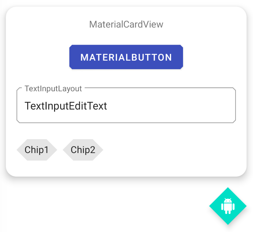
We can observe that some widgets like the Chip or the FloatingActionButton override the cornerSize of the theme. For the FAB, the cornerSize will be computed to always be 50% of the size of the fab.
Wrap-up
<br>MaterialShapeDrawable<br> is a very powerful tool used a lot across the Material Components library. You have learned how to use it directly in code to build very specific shapes and you also learned how to use it in your layout files and to customise your app theme to globally change all the shapes of your application.
Material Components are open-source and you can find the code on Github.
If you want to go further with Material Theming (colors, typography etc…), I highly recommend Styles, Themes, Material Theming, Oh My! by Anita Singh.
I hope you will have fun experiencing with it in your own apps!
FAQ
What is MaterialShapeDrawable?
MaterialShapeDrawable is a Drawable provided by the Material Components library for Android. It can draw custom shapes and handle properties such as colors, strokes, elevation, shadows, corners and edges.
What is ShapeAppearanceModel used for?
ShapeAppearanceModel describes the corners and edges of a MaterialShapeDrawable. It can be used to define rounded or cut corners, custom corner treatments and custom edge treatments.
Can MaterialShapeDrawable be used directly in XML?
Yes. Material Components widgets such as MaterialButton, FloatingActionButton, MaterialCardView and TextInputLayout use MaterialShapeDrawable internally. Their shape can be configured with the shapeAppearance attribute in an XML style.
How can I apply the same shape to several Android widgets?
Material Theming allows you to define default shape styles in your application theme. The attributes shapeAppearanceSmallComponent, shapeAppearanceMediumComponent and shapeAppearanceLargeComponent can then be used to apply the same shape configuration to several Material Components widgets.